Understanding the Digital Math Experience
The prototype worked in the classroom. Alone at a screen, children fell apart.
- Client
- Math EdTech Client
- Sector
- Education, Digital Learning, UX Research
- My Role
- Research Lead
- Method
- Eye tracking glasses + MOXO sensor observation, 19 children
The math team had built a working prototype for teaching addition — double and single digits, animated, polished. It performed well when teachers were present. Then we put 19 children in front of it alone.
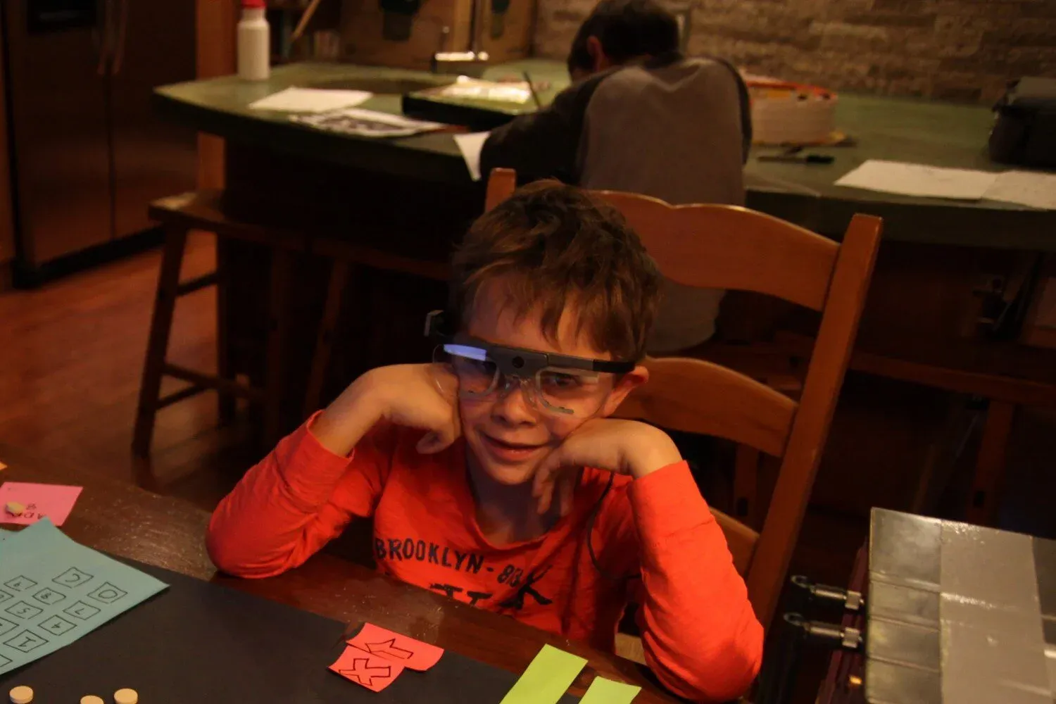
Children wore eye tracking glasses and MOXO Sensors as they tried to learn the concept of addition.
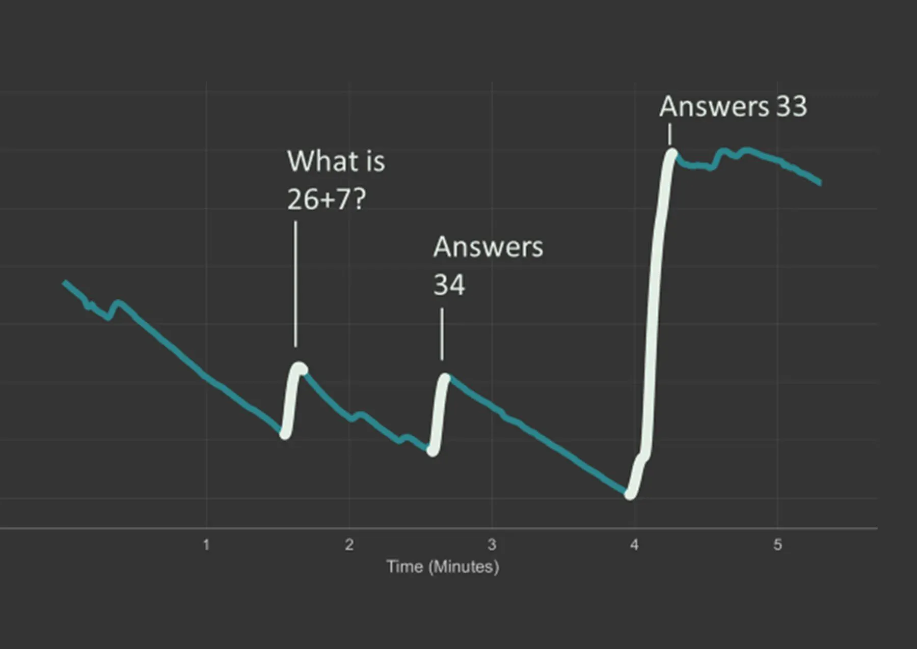
Each child wore eye tracking glasses and MOXO sensors measuring skin conductance. We watched what they actually looked at, where they disengaged, and where their stress spiked.
What we found was a fundamental mismatch: the prototype was designed the way classroom teachers teach. But children learning alone on a screen are in an entirely different situation. The pedagogy didn't transfer.
""Our results helped the team understand how classroom pedagogy does not work when children are learning by themselves digitally.""
Three Things the Data Revealed
Long Animations Disengage Within 5 Seconds
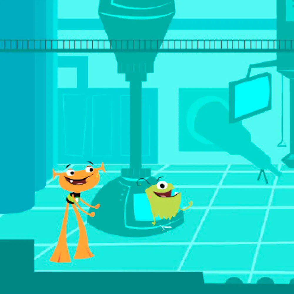
The original prototype used long animation clips — movement, jokes, teacher-style instruction — to explain concepts. Eye tracking showed children watching for a few seconds, then mentally checking out. By the time the key instructional moment arrived, most students had already disengaged. The fix wasn't to make better animations. It was to make them shorter. Animations should serve as brief introductions only — after roughly five seconds, they stop teaching and start losing people.
A major finding was that animations talking to students about educational concepts was highly ineffective; children often stopped watching altogether. The "talk at" method of teaching didn't work in the digital space.
Minimal Feedback Creates Helplessness
When children got something wrong, the original response was: "That's not right; try again!" After three failed attempts, the answer was simply given. Sensor data showed children learning helplessness — they clicked through, waiting to be shown the answer. Dynamic feedback, by contrast, became the primary teaching mechanism. When the system responded to wrong answers with information rather than just correction, children learned from their mistakes instead of waiting them out. The difference between a teaching moment and a "click-to-continue" experience was in the specificity of the feedback.
This was the first time we saw that answering questions was highly engaging, which would eventually lead to our framework of "The Feeling of Learning" as the backbone of engagement.
Educators typically blame content being too easy or too hard for why it doesn't work. We challenged them to think about adding scaffolding and support when things get tough.
Interfaces Must Be Explicitly Taught
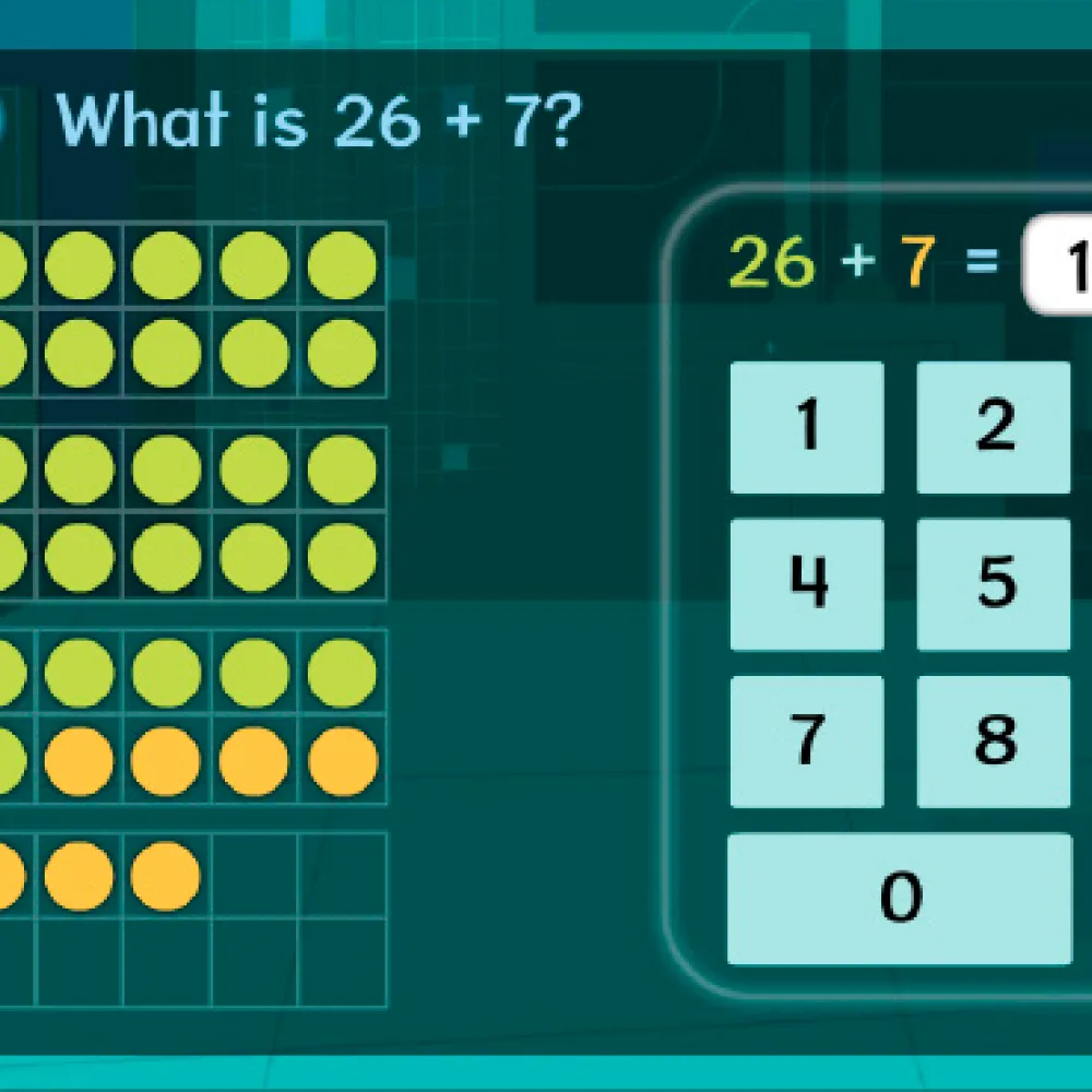
Children who couldn't figure out the interface assumed they didn't understand the math. The two things were completely conflated. A child who couldn't find the "+10 button" wasn't confused about addition — they were confused about the interface. But what they experienced was math failure. The fix was treating interface teaching as content: model every new button, explicitly, before asking students to use it.
For example, they learned the +10 button adds an entire 10 bracket through a character hitting the button and saying, "Your turn! Can you add 10 apples?"
By the time we had improved the UX and taught the child how to use the tool, they had also learned the math concept.
When children understood how to use the tool, they also learned the math. The UX was the pedagogy.
The Core Finding
Digital math tools that replicate classroom instruction miss something essential: in a classroom, a teacher can read the room, answer questions in real time, and adjust on the fly. A screen can't. The design has to compensate for the absence of a human — not by adding more instruction, but by building feedback, scaffolding, and interface clarity directly into the experience.
What the Client Said
"I can't believe that he could identify problems and come up with some solutions on the spot without having to bring it back to an editor. I love that he created his own prototype. I consider him a real asset to our team and I wish I could articulate better how much I enjoyed working with him."
"This is 100% absolutely amazingly helpful. I'm learning, they're helping me think about the design of the product, and it's so incredibly INFORMATIVE... Even in just watching Sara and Elliott work with the 'digital' paper prototype — I'd love to learn how to do more of that. That was very cool."
"Wow — super impressed with Elliott's findings This is really powerful data to be getting. And just seeing the kid get bored was a powerful image."
The tool was well-designed. What was missing was the teacher. Build the teacher into the design.
If this landed, forward it to someone building digital learning tools.
New essays on AI, education, and building things that matter.